Thursday, May 28, 2009

The problem with black

I've said it before and I'm sure I'll say it again. Throw out your black paint. Any artist worth their brushes should be able to mix a black to suit their purposes without resorting to using something unnatural like Mars Black out of the tube.

Giving a tube of black paint in every starter set is a set up in my opinion. That, and they insist on including Veridian which is either the cheapest paint in the whole world to make, or else, someone out there is just trying to piss me off. Nothing is veridian and so many new artist just pick it up 'cuz that's the green it came with' and proceed to paint trees, grass, envy, whatever, straight out of the tube and result in landscapes with trees the color of interstate road signs and elementary school chalkboards. If you are painting one of those things, then Veridian is your gal, but if you're not... no touchy the Veridian.

But, I digress. My beef today is with Black. We've all seen those old men and women and angst ridden teens with hair dyed super-black. It's super-unnatural. No ones hair is pure black. No ethnicity has hair with no other tints or highlights whether they are red, blue or even greenish, but that fake black hair just looks like your grandmother's wig.

the reason is because, with few exceptions, nothing in nature is pure black. It's all made of other colors.

Have you ever tried to match black clothes? Of course. It's hard to do because those dyes are made of a base of one of the primaries, red, blue or yellow and those blacks after about 2 washes will start to take on the tone of that underlying color and your blueblack pants don't match your redblack shirt anymore.

In a painting, there are so many ways to make a rich black there is no reason to be so lazy, uncreative, or boring as to use black straight out of the tube.

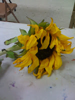
Raw umber and French Ultramarine make a great black. a deep neutral black. So can many red and greens, blues and browns etc. Play around. Chances are, whatever purpose you think you want 'black' what you really want is really dark red, or blue, or brown. If you make a really dark red, blue or brown, while our eyes will interpret it as the darkest dark, the color, however 'black' in appearance will have undertones of warmth or coolness, or whatever attributes your mixing colors had. Here...look at this painting.

The background looks 'black', but it's about 10 glazed layers of a mix of raw umber, ultramarine and a few random glazes of blues and even a violet or so.
The resulting depth, while of course an illusion, looks like space and infinity rather than my grandmother's wig.

I'm just sayin'

Wednesday, May 27, 2009

Step 3 (ish) Sunflower tutorial

Hola.

So, if you're a purist, your head's gonna spin around because I'm sort of fudging the 3rd step here.

What I've done in step three was address the background. I'm not sure why. I think because I was so unsure what I was going to do, I thought I'd just do it and see if I could live with it. Cause if not...nows the time to find out. Not when we've spent hours on the flower, only to screw up the background.

I used Windsor and Newton transparent marroon and...um... let me check, purple madder with a touch of French Ultramarine. What's the difference in Ultramarine and French Ultramarine? The French one gives up easier I guess.

That being said. I still couldnt decide exactly what was going on in the background so I varied the reds/purples to give the illusion of the flower sitting on something with depth, but not trying to imply any specific surface.
This image shows the background with just 2 glazes. Because this background is painted onthe background of the white canvas and all three colors are very transparent, the light shows through them, bounces off the white canvas and makes them brighter. In the last post, I mentioned that you needed to think about your background and this is why. If I'd tinted the background with umber it would have given the background a deep deep blood red tone which would have been very classical, but maybe a touch heavy, so...the gamble paid off and I'm happy enough with it to go on with the flower. Chances are, this will get at least 2 or 3 more glazes before I'm done. Who knows. We shall see.

Step 2 Sunflower tutorial

Howdy. Ok. So, basically the next step, once our drawing is as correct as it can be is to tone it with raw umber. I like Windsor and Newton raw umber, but brand is really just about preference so...whatever you like and/or can afford.

Anyhoo. What we want to do now is paint our subject in a monochrome value study. If you need help seeing the values, a sheet of red acetate (available at most craft stores) will help. the red takes the color away and you can easily see what's lighter or darker. It can be deceiving. Our bastard left-brain wants to say that green is always 'darker' than the yellow, but that's not the case. Really look at the petals and leaves. Is that petal darker or lighter in VALUE than the leaf? Your lightest value can really be left white....or you can paint it white. Doesn't matter and sometimes I do one and sometimes the other.

The other thing to consider at this stage is what's the dealy-o with the background? The funktified table that's in the picture could work, but...maybe put it on cloth, or wood...you're the artist. Make it up. I'm pretty partial to the wood fading to infinity blackness like the old masters, but in this case I decided to go with a sort of non-descript red background. I'm ahead of myself, but you need to give it some consideration because depending what you want to do with the background, you may want to include the background in your value study. Especially if the darkness of the background effects the shadowing etc of your subject.

So, here we go. Here's my umber study.

Now, I did include the shadow under the flower but I really didn't give the background much attention. It certain effects the final outcome, so...now's the time to make the decision.
Just like in the last stage, take your time. Watch your edges. Think about what you're painting. It's leaves and petals. No surface is perfectly horizontal or vertical. So don't paint that way. Don't just paint back and forth, follow the form of the thing you are painting. That's always true. It doesn't matter if it's a child's face, an apple, rough tree bark or a flower petal. Think about how your hand would trace over that surface and let your brush follow that path. I see so many students paint animals, like their cat and they paint the fur UP DOWN UP DOWN. That cat would scratch your face off it you pet it that way. The fur follows the contours of the body. so should your brushstrokes.
Ok...have at it.

Tuesday, May 26, 2009

7 Step Sunflower tutorial

Greetings. I thought I'd start by walking through a kind of 'what's on the easel' type entry. I'll do a sort of step by step demo of an oil painting of one of my favorite things...a sunflower. This particular sunflower had apparently passed the date of approval from its previous owner and was on it's way to the great compost heap in the sky. Just goes to show you that if you look around, you'll see beauty in strange people, places and things.


Here's our subject


This little guy had some siblings...
I liked the slightly wilted look of these and played around with looking at them from various angles etc. before settling on this guy all alone.


Once the subject was decided on, I thought I'd do a kind of quick study so I'm going with 9x12. Big enough to frame and look good, but not so large that I'll be futzing with this for weeks.


Step number 1.


The drawing.


I used a mech pencil and sketched directly on the canvas. Some people like charcoal or a really soft pencil, but I find that you wind up fighting the graphite/charcoal in the next layer. It's not perfect, but it's pretty cleaned up and ready to go. Take your time. The drawing is the key, the cornerstone. Every subsequent layer depends on the drawing. If it's not right, the finished work will not be right. Be patient, do it right. You wont be sorry. I can't tell you how many of my students futz around 4 or 5 steps from now and try to adjust mistakes made in THIS stage only to admit that...what do you know, I was right...they needed to leave it alone and trust their original drawing.

In the next step will work on toning the image. But for now, just get the drawing right.