Tuesday, December 15, 2009
Painting trade
Next Monday, the fine ladies from class are coming over for a lunch and painting trade. We've been trading journals for awhile, but this time we are going to trade a painting, 12" or smaller. I'm kind of excited. These ladies paint in oil, acrylic, watercolor, etc. So, who knows what we'll get. I'll post pictures of the luncheon and the paintings traded next week.
Tuesday, November 24, 2009
The ATC
Today, I've been doing a million errands and small jobs. And as it is officially "Be A Total Jerk At the Grocery Store Because YOU Are The Only One Who Still Needs Something For Thanksgiving" season, I've needed to do small things to make me happy. Today I worked on a few ATC's in between laundry, raking leaves, shopping, etc etc. If you're not familiar, the ATC is the Artist Trading Cards. There are a lot of ways to go with this little buggers. The only rule is that they are of a uniform size (2x3 inches) and that they are NOT for sale, they are for trade. Of course, there are artists out there who create such MAGNIFICENT works that they simply MUST sell them (note sarcasm) that you can sell them as limited edition some sort of nonsense or other.
Also, people do all kinds of things with these. From textiles, to collage, painting, sewing...you name it. I of course, just paint mine. And almost always in watercolor for the simplicity and speed.
Like my rant on 'journaling for journaling's sake, where people get so caught up in creating this masterpiece of work in a journal that will earn a spot in great libraries like Da Vinci's codex...again with the sarcasm. I think I'm hungry. Anyway. I think that the ATC should be a quick outlet to create something transient. After all, the point is to trade them away. Sometimes I work out compositions for larger works, or just play with color, or...whatever.
So, here are two that I did today. Enjoy.
Thursday, November 19, 2009
A small one for warm up
Many of the artists I admire do several paintings a week. This can be a crutch in itself not unlike my little rant on sketchbooks and ATCs, but those whom I admire paint this often because thier style lends itself to it. My paintings can take anywhere from a week or two to a year. But I try to complete a few small ones once in a while to keep loose and reconnect with color and just have fun with paint. Here is yesterday's.

Small Pears (Oil on canvas 5x5)
Tuesday, November 17, 2009
The holiday rush begins
The fall weddings are over. The Halloween party is over. Thanksgiving is a week away. If we wait until we have 'time' to paint, it will never happen.
I find myself jumping between oils and watercolor (didnt I ever learn that oil and water dont mix?). Also, I find I waffle between works that take weeks and 'paint a day' type work. I have the time, I wish I had the tenacity to finish a work, even a small work, every day or two.
Here is one of my latest. I rarely paint anything with a thought to it's given ending location. Usually I dont paint for myself anyway, but in this case, I needed something to go over our couch. The room has a lot of roses in it. I am also spoiled in that the house itself often has roses as I have the most generous husband in the world. So, the subject, the color, the size...all came together. Sure, I'd include it in a show and even sell it if the opportunity arose, but for the time being...it's already found its home. I hope you enjoy it.
 (Olive Roses. Oil. 36x36)
Tuesday, October 6, 2009
Monochromatic Painting

This week the task was to create a monochromatic painting. This is a 36 x 36 oil with only Windsor and Newton's Olive green and Titanium White. Now the technique that I like to teach with the 'seven steps' used by the Old Masters is similar, but I kind of combined steps 3 and 4 and used white in what would have been my underpainting. My monitor is a bit screwy and I think the ratio is off so everything looks stretched horizontally to me. Hopefully, this looks alright. enjoy.
Wednesday, August 26, 2009
Today's painting

This is today's practice painting. I'm doing a larger painting that features this peeled orange and I thought it'd be fun to do a small study. It's 5x7 oil.
The rest of the painting has one of my favorite bowls. A small silver bowl with a blue laquered interior. I like the green background. I may use it for the large painting as well.
I spent some of this afternoon browsing through a book about the Dutch masters. I'm quite partial to the portraits and especially the still lifes. I dont know that I'd ever try one of those complicated fru-fru flower ones, but I love the variety of surfaces in the paintings. Big pewter tankard, silver dish, always a peeled orange for some reason. sometimes bugs or a dead fish. Not sure the point of the bugs or fish. But...I love the look and I love the challenge of the different textures.
So...just thought I'd post todays work while the big one is in progress.
Tuesday, August 25, 2009
Christmas in August

First...here's a tiny fellow on the easel right now.
I walked out to the mailbox today and when I opened it up, there was a bright light and angelic singing... Turns out, it was the Blick 2010 Art Supply Catalog. Woohoo.
It was reminiscent of those days when that huge Sears catalog would arrive and I'd sit somewhere comfy and look at every page of the toy section and dog ear pages and make a note for my Christmas list. Yesterday was kind of like that. I made a cup of tea and curled up in the big chair and dived in.
Some people might flip right to the oil paint page, or the canvas, or to printing supply. Not me. I look at every page. I read every description of the product. There are paint companies that I didnt know existed. There are ones I thought were long out of business. There are ones that probably SHOULD be out of business. I scan paints I never heard of to see how much their Cobalt Blue was (always the pricey one).
I think we as artists can easily get stuck in a groove. I use THIS paint, and THIS brush and THIS canvas or whatever and we forget to look around at all that is possible. Forget that there are new advances and old techniques. New equipment and old favorites.
Through the years, I switched mediums every few years or so. I did charcoal, then pen and ink, then ink like watercolor, then pastels, colored pencils, illustration, still life, animals, portraits, abstracts....The bad part of that was that sometimes I feel that I dont have a particular 'style'. That if I showed 20 works in a variety of the range that I can do...people wouldnt necessarily be able to say, "ah, that's a Karen May...I like her work). For example, I recently showed 4 works at a financial centers open house shindig. I went to the open house and listened to people tell me what artwork they liked and yadayada. More than one person said "I really like these" (pointing to my 2 photorealistic oils), but I also like those (across the room were two oil landscapes that I'd done). I was flattered that they picked out my work as their favorites, but they had no idea that they were the same artist.
Anyhoo...I digress. I think that we should remember to look around and try new things. It doesnt have to be goofy and dangerous or expensive...just pick up some oil pastels for a change and sketch. Grab a travel watercolor set and do a few florals. God forbid...pick up a pencil and practice drawing again.
The catalog keeps me in touch with that. Just look at what's out there. Every new page and section I was like "ooooh....ahhhhh". What's next? what havent I tried? Silverpoint? Encaustic?
I am like the buffet at the Belagio. Give me some of EVERYTHING!!!!
Thursday, August 20, 2009
To teach or to 'take'. Art classes
There are lots of adages about teaching. My Dad used to say "thos who can-Do, those who can't-Teach". Granted, he was an engineer and people who never left the hallowed halls of academia, but continued to teach from the latest text sources, may not have inspired great respect. In some fields, school gives you the tools and you are supposed to then run with it, keeping ahead of the curve, on top of the wave and all kinds of other silly sayings. There are other fields however that are ever changing and new discoveries and advances in science create the need for people willing to not only never leave academia, but to impart knowledge and pass the torch to a new group who will in turn, do the research, come back to teach...etc. For example, my sister is a doctor of archaeology. In her field, while the subject matter may be dry as dust (hee hee) get it? nevermind. While the subjects of study are usually long gone, new advances in technology, new tools and better understanding constantly challenges the accepted conceptions of the past. It's the complete opposite of math. There's no going back in math. In archaeology, going forward enables them to go further back.
Now uncross your eyes because this IS relevant to art. Art swings both ways so to speak. Art is about the past, somewhat about the present and about the future. We study the masters while employing new graphic tools and technology to improve what we do today and create something that will last well into the future.
If math is like a hallway where every advance firmly closes the door behind it and archaeology advances allows more and more doors to be unlocked further back, art is the funhouse where all of the doors are open, some hallways go nowhere, some doors are brick walls pretending to be doors and every door is different and you can call yourself an artist and open as many or as few as you want in any direction.
So...teachers of art. Those who can, should teach. Those who can't unfortunately, sometimes teach also...but...that's another story.
If you are a student of history and love the great masters, you can impart to a new crop of picker-uppers-of the paintbrush what they can learn from those who came before. Or, you can show them the past so that they see what NOT to do. If you develop a new technique, why hide it under a bushel basket...shine your light baby.
As a teacher, while I may be teaching a specific technique or idea, there are very few rules and many of them are like my mother-in-laws angel figurines...made to be broken. I learn as much from teaching as I think my students do. They're discoveries or 'mistakes' teach me more about what I know, what I want to try and where to go.
Now, we all know 'artists' (usually pronounced "ARTEESTS") who wear black turtlenecks, berets, and pretend they are french who think they have nothing to learn and if you dont know what they know, if you dont collect the obscure artist they looooove, then poo poo you. Forget them. they are like artistic dung beetles who gather thier toys, names, references and 'travels' around them and feel superior in describing everything as 'exquisite...simply exquisite". Pbttthhhhhh. If you come across a 'teacher' lke that...run away...run far away.
But dont forget to take classes too. I teach and I take. I learn from both. sure, I took figure drawing in college, but that was a long time ago. Get back in and charcoal yourself some nekkid folk. Yeah, you slogged your way through color theory, but who couldnt use a refresher or just a new way to look at your old pallete. Try a class in something you dont think you like. I personally want to throw myself on the floor like a 4 year old in WalMart when someone shows me what passes for abstract art. I just dont like it. Yet, when my teacher assigns something abstract, I do it. I try it. She hates it. I learn.
If you can't...well...then take up raquetball, but if you can.... take classes and teach some. There's always someone who could learn from what you know and there's always someone 'better' than you.
Have fun opening doors.
Friday, July 10, 2009
Todays mini painting

While some of it's big brothers are in drying stages, I've been tackling small paintings. I wont be so bold as to call it a 'painting a day' which I'm sure I wont paint, and also, like a sketch journal, I'm not sure that painting a painting a day solely for the sake of painting one a day is helpful in it's own right. If you want to paint every day a create a painting for the same reason that a runner stretches before a marathon, then I think it is a helpful exercise. If, though, one creates for the sake of a quota or in lieu of other painting, I'm not sure of the purpose.
But, created because I wanted the practice and while I was waiting...here is my small painting for today. This little guy is 5x5 oil on canvas
Enjoy.
Thursday, July 2, 2009
EDM Every Day Matters. Why yes it does-my thoughts on sketch journals
I've decided to join up with the group Everyday Matters which is a drawing 'challenge' group. BAsically, they post a suggestion of a topc for drawing once a week and then you have a week to come up with something.
There are good and bad things with sketch journals. I think that somewhere, a few years ago, someone was keeping a sketch journal where they'd draw their daily coffee or spoon or whatever, label it with cute letters and write some Twitter-esque bit of prose to go along with it. Usually this was done in pen and may or may not have been colored in.
Since then, for some reason, this has become the style-regule for sketchbook artists and in a way, I think instead of promoting creativity, it stifles it a bit because newbies think that this is the way sketch journals are 'supposed' to look, so...they do the same. The same somewhat wiggly lines, the same slightly out of proportion drawings, the same washes of color and the same thoughtful insight on the latte of the day. PBTTTHHHHHH.
It's kind of like Bob Ross. Think what you will of his art, you have to give the guy credit for bringing art to probably millions of folks who would have otherwise never picked up a brush or had the cahones to attempt an oil painting. What happens though is that the technique is so formulaic and foolproof that people get comfortable with that 'style' and techinique and can never escape the land of the almighty tree and the majestic mountain and old rugged barn. I long for a still life. Forget the sunlit wave and paint an apple for god's sake.
I think that sometimes sketchbooks can become the same crutch. I have millions of sketchbooks. Some of them alternate between barely sketched ideas and dozens of thumbnails to work out a painting idea I have, to finished drawings and pretty groovy works on thier own. mixed in is the occasional grocery list and unlabled phone number. But, I'm not bound to my book (haha. get it...bound...to a book...nevermind). The sketchbook should be a tool, a means to an end, a catalyst or springboard. It can be a work of art in itself, but not a genre. I think that while a sketchbook may be a tempting, comfortable and maybe even easy 'gateway' art for people who like the site says "havent picked up a pencil since elementary school', but regardless of your expertise or even goals, it would be a shame for what seems to be a catalyst for creativity actually creating a fenced in world of it's own.
That being said, I think that for now, I'll follow the EDM and post some of my sketches here. But...I will also post some of my paintings, musings, sketches and ideas that are not dictated by anyone by my own little monkey muse in my head.
Thursday, June 11, 2009
Finally...some color

So...Our first color layer.
After the last step, we were left with what looked like a moonlit picture of a sunflower. If the background had not already been red (yes, yes, I know...deal with it) the effect would have been lovely on its own, but now we get to the fun part and that's...adding color.
Because we did the hard part several steps ago and established the values of our subject and then honed those value judgments in the dead layer, all we really have to do now is color it in like a coloring book.
Here's another example where I dont want you (and you know who you are) to try to reinvent anything at this point.
Look at the subject. Look at each petal. while there are varying VALUES of yellow...are there really different COLORS of yellow. In this case, because our flower was dying, there were subtle color changes, but in the case of the leaves for example...they were just...green. Light and darker green, true, but all the same COLOR of green. So...while avoiding Veridian like the H1N1 virus, mix a nice green. (Sap Green is always a good bet...nice and transparent to boot). Now...pick a leaf (or whatever subject you're working on) and simply 'color it in'. Yep, just paint right over the whole leaf with the ONE shade of green that you've mixed.
Low and Behold...Lord a'mighty...look at all of the values of green that show up. That's because we're applying a thin glaze over our established value layer thereby creating a tonal shading of the green leaf. Now, if the leaf had some yellow areas, or in this case, some brownish dead spots, those will have to be addressed later.
What we dont want to do and what you shouldnt have to do if you've followed directions up to this point is mix 'lighter or darker...color".
In this example...all leaves were painted with Sap Green right out of the tube. (very little liquin even). The petals had a little bit of variety in the yellow, varying from cadmium yellow to the Oh so delicious 'Indian Yellow" which is simply Sunshine in a Tube. What I didnt have to do is vary the shades or tints of these yellows. Straight on the canvas because, again...the value work is already done.
If you wanted really light spots, the underlying dead layer should have been white. Get it? There is rarely a need to add any white to a color at this point. later, we'll add some white for details,but not at this point.
In fact, adding white to any of our colors at this point will ruin the effect. That's not overdramatic, it's simply a fact. Adding white to any paint makes it opaque (non transparent) which means we c'aint see through it...and if we can't see through it, then all previous layers are/were a complete waste of time.
One thing that I hear again and again from my students at this stage and in about 3 more steps is "Y'know...you were right. I wish I'd listened to you...NEXT TIME..." So...save yourself the time and frustration and do it right the first time.
Enjoy the first color.
Next...MORE COLOR. Woohoo!
Wednesday, June 3, 2009
Step 4. The Dead Layer
Howdy.
In step four of our sunflower demo, we'll do what is known as the Dead layer, or Grisaille layer. Basically, this layer creates a layer of exact values similar to the previous umber layer, but with more emphasis on the important parts of our painting.

You can do the entire picture in the dead layer, but I think emphasizing certain elements gives the finished work more punch and pizazz.
I've applied another glaze layer to the background deepening the red/violets and plum colors. Still using Purple Madder, Transparent violet and French Ultramarine.
To create the moonlit effect of the dead layer we need a neutral grey. Now... may have gotten a sense about how I feel about black -out of the tube. So...'nuff said 'bout that. Mix a neutral black. I like to use Raw Umber and Ultramarine. Maybe the slightest bit more umber than blue. When you mix them, spread a bit out on your palette and you'll see when you've reached a deep luscious black. That's what we want. Try mixing a tiny bit with white. You should wind up with a very neutral gray. If you're not sure, get a value scale from any art store, or even compare the gray to something that you know is neutral.
So, when you've made this lovely black and ensured that your grey is neutral and NOT blue (which many people err on the side of) you're ready to go.
Note: your lighting has a lot to do with it. You may find that if you work in different lights that your greys will look different. Try to work in natural light or with a full spectrum light bulb.
Now that you've got your black and subsequent grey, you can paint your dead layer. You do this by strictly following the values you established in the umber layer. Remember in step one when I said every step is built on the one before. You're brown values followed your drawing and now your dead layer will follow your umber layer. Do NOT reinvent the wheel here. If you think you've made an error in the drawing, live with it. No one is going to have the original item or photo when they view your painting to say "hey dude, this petal isnt as full as it should be'. Trust your underlying layer.
Using your created black and varying amounts of white (I use Titanium white. ) follow the values laid down previously and basically, very carefully and purposefully, paint your subject as though the finished work will be monochromatic. Keeping in mind the surface of the thing you are painting. In this case, following the flower petals the way they naturally grow.
If you tend to paint more impressionistically day to day, be extra careful to hide brush strokes. We arent going for painterly here. We're going for glowing glorious realism. Not to say anything is wrong with painterly and free impressionism, but that's not the point of THIS painting. so...hide those brushstrokes. It might even do you well to have a nice soft clean brush on hand to smooth out any rough bits. (be sure to clean or wipe off this brush regularly).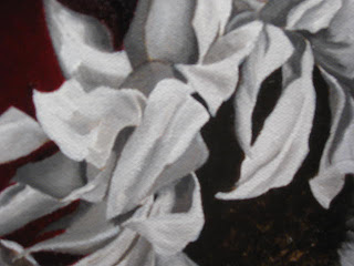

When you are finished, as you can see in this closeup, you'll have a monochromatic very detailed painting with the grey emphasis on your main subject, in this case, the sunflower.
Next step is where the fun comes in. The color glazing.
Thursday, May 28, 2009
The problem with black
I've said it before and I'm sure I'll say it again. Throw out your black paint. Any artist worth their brushes should be able to mix a black to suit their purposes without resorting to using something unnatural like Mars Black out of the tube.
Giving a tube of black paint in every starter set is a set up in my opinion. That, and they insist on including Veridian which is either the cheapest paint in the whole world to make, or else, someone out there is just trying to piss me off. Nothing is veridian and so many new artist just pick it up 'cuz that's the green it came with' and proceed to paint trees, grass, envy, whatever, straight out of the tube and result in landscapes with trees the color of interstate road signs and elementary school chalkboards. If you are painting one of those things, then Veridian is your gal, but if you're not... no touchy the Veridian.
But, I digress. My beef today is with Black. We've all seen those old men and women and angst ridden teens with hair dyed super-black. It's super-unnatural. No ones hair is pure black. No ethnicity has hair with no other tints or highlights whether they are red, blue or even greenish, but that fake black hair just looks like your grandmother's wig.
the reason is because, with few exceptions, nothing in nature is pure black. It's all made of other colors.
Have you ever tried to match black clothes? Of course. It's hard to do because those dyes are made of a base of one of the primaries, red, blue or yellow and those blacks after about 2 washes will start to take on the tone of that underlying color and your blueblack pants don't match your redblack shirt anymore.
In a painting, there are so many ways to make a rich black there is no reason to be so lazy, uncreative, or boring as to use black straight out of the tube.
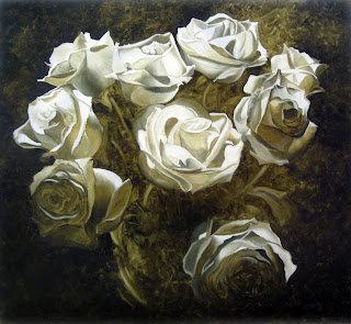
Raw umber and French Ultramarine make a great black. a deep neutral black. So can many red and greens, blues and browns etc. Play around. Chances are, whatever purpose you think you want 'black' what you really want is really dark red, or blue, or brown. If you make a really dark red, blue or brown, while our eyes will interpret it as the darkest dark, the color, however 'black' in appearance will have undertones of warmth or coolness, or whatever attributes your mixing colors had. Here...look at this painting.

The background looks 'black', but it's about 10 glazed layers of a mix of raw umber, ultramarine and a few random glazes of blues and even a violet or so.
The resulting depth, while of course an illusion, looks like space and infinity rather than my grandmother's wig.
I'm just sayin'
Wednesday, May 27, 2009
Step 3 (ish) Sunflower tutorial
Hola.
So, if you're a purist, your head's gonna spin around because I'm sort of fudging the 3rd step here.
 What I've done in step three was address the background. I'm not sure why. I think because I was so unsure what I was going to do, I thought I'd just do it and see if I could live with it. Cause if not...nows the time to find out. Not when we've spent hours on the flower, only to screw up the background.
 I used Windsor and Newton transparent marroon and...um... let me check, purple madder with a touch of French Ultramarine. What's the difference in Ultramarine and French Ultramarine? The French one gives up easier I guess.
That being said. I still couldnt decide exactly what was going on in the background so I varied the reds/purples to give the illusion of the flower sitting on something with depth, but not trying to imply any specific surface.
This image shows the background with just 2 glazes. Because this background is painted onthe background of the white canvas and all three colors are very transparent, the light shows through them, bounces off the white canvas and makes them brighter. In the last post, I mentioned that you needed to think about your background and this is why. If I'd tinted the background with umber it would have given the background a deep deep blood red tone which would have been very classical, but maybe a touch heavy, so...the gamble paid off and I'm happy enough with it to go on with the flower. Chances are, this will get at least 2 or 3 more glazes before I'm done. Who knows. We shall see.
Step 2 Sunflower tutorial
Howdy. Ok. So, basically the next step, once our drawing is as correct as it can be is to tone it with raw umber. I like Windsor and Newton raw umber, but brand is really just about preference so...whatever you like and/or can afford.
Anyhoo. What we want to do now is paint our subject in a monochrome value study. If you need help seeing the values, a sheet of red acetate (available at most craft stores) will help. the red takes the color away and you can easily see what's lighter or darker. It can be deceiving. Our bastard left-brain wants to say that green is always 'darker' than the yellow, but that's not the case. Really look at the petals and leaves. Is that petal darker or lighter in VALUE than the leaf? Your lightest value can really be left white....or you can paint it white. Doesn't matter and sometimes I do one and sometimes the other.
The other thing to consider at this stage is what's the dealy-o with the background? The funktified table that's in the picture could work, but...maybe put it on cloth, or wood...you're the artist. Make it up. I'm pretty partial to the wood fading to infinity blackness like the old masters, but in this case I decided to go with a sort of non-descript red background. I'm ahead of myself, but you need to give it some consideration because depending what you want to do with the background, you may want to include the background in your value study. Especially if the darkness of the background effects the shadowing etc of your subject.
So, here we go. Here's my umber study.

Now, I did include the shadow under the flower but I really didn't give the background much attention. It certain effects the final outcome, so...now's the time to make the decision.
Just like in the last stage, take your time. Watch your edges. Think about what you're painting. It's leaves and petals. No surface is perfectly horizontal or vertical. So don't paint that way. Don't just paint back and forth, follow the form of the thing you are painting. That's always true. It doesn't matter if it's a child's face, an apple, rough tree bark or a flower petal. Think about how your hand would trace over that surface and let your brush follow that path. I see so many students paint animals, like their cat and they paint the fur UP DOWN UP DOWN. That cat would scratch your face off it you pet it that way. The fur follows the contours of the body. so should your brushstrokes.
Ok...have at it.
Tuesday, May 26, 2009
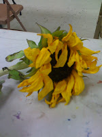
7 Step Sunflower tutorial
Greetings. I thought I'd start by walking through a kind of 'what's on the easel' type entry. I'll do a sort of step by step demo of an oil painting of one of my favorite things...a sunflower. This particular sunflower had apparently passed the date of approval from its previous owner and was on it's way to the great compost heap in the sky. Just goes to show you that if you look around, you'll see beauty in strange people, places and things.
Here's our subject
This little guy had some siblings...
I liked the slightly wilted look of these and played around with looking at them from various angles etc. before settling on this guy all alone.

I liked the slightly wilted look of these and played around with looking at them from various angles etc. before settling on this guy all alone.

Once the subject was decided on, I thought I'd do a kind of quick study so I'm going with 9x12. Big enough to frame and look good, but not so large that I'll be futzing with this for weeks.
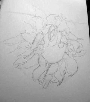
Step number 1.
The drawing.

I used a mech pencil and sketched directly on the canvas. Some people like charcoal or a really soft pencil, but I find that you wind up fighting the graphite/charcoal in the next layer. It's not perfect, but it's pretty cleaned up and ready to go. Take your time. The drawing is the key, the cornerstone. Every subsequent layer depends on the drawing. If it's not right, the finished work will not be right. Be patient, do it right. You wont be sorry. I can't tell you how many of my students futz around 4 or 5 steps from now and try to adjust mistakes made in THIS stage only to admit that...what do you know, I was right...they needed to leave it alone and trust their original drawing.
In the next step will work on toning the image. But for now, just get the drawing right.
Subscribe to:
Comments (Atom)